CHRISDAVIDG
CREATIVITY + INNOVATION + SPORTS
WORLD CHAMPION IDENTITY
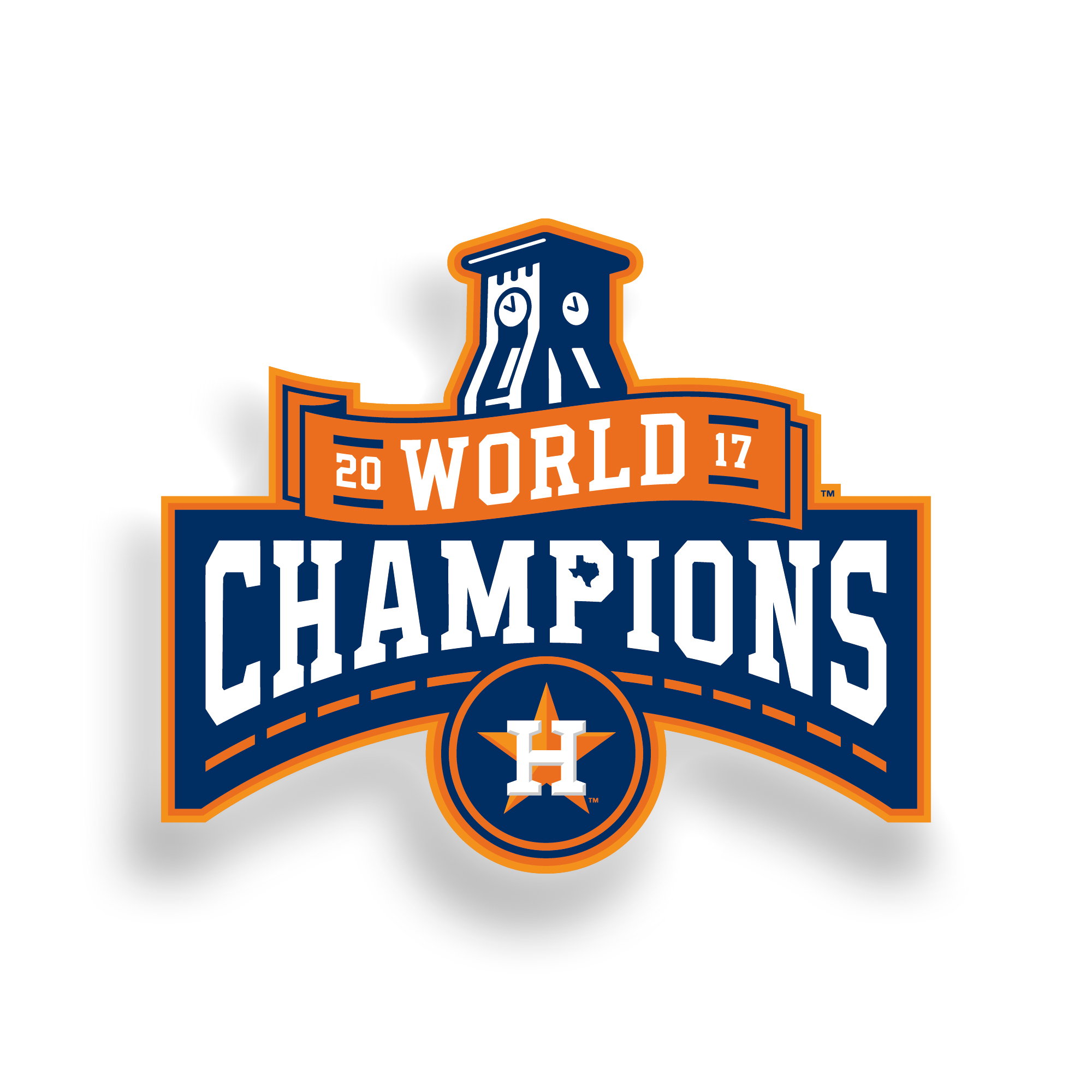
The Official 2017 Astros World Champions Logo
Created to commemorate the winning of the 2017 World Series™
WE ARE WORLD CHAMPS!
NOW WHAT?
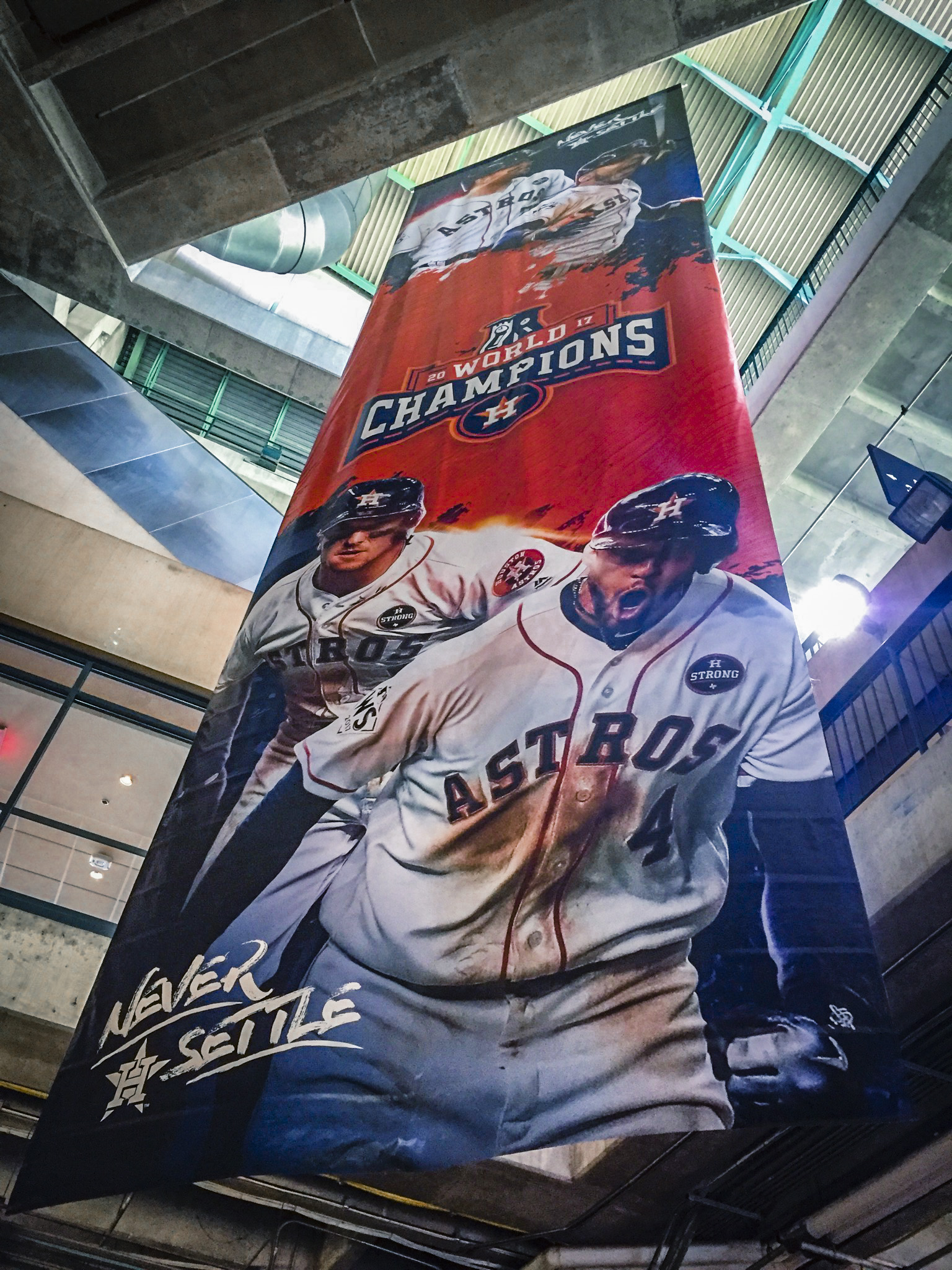
When the Astros won the final series a lot of people were focused on partying, drinking, celebrating, reveling, and so on (you get the point, lol)...but we got to designing...almost immediately.
The design team and I had a massive challenge ahead, how do we visually communicate "WE WON IT ALL!", that Houstonians are world champions now?
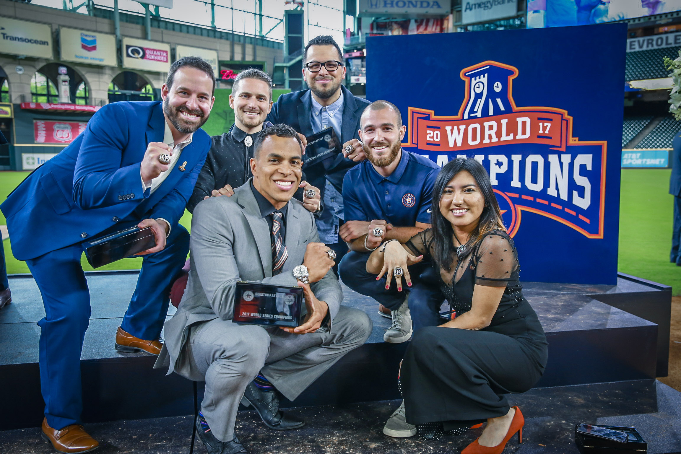
Another more business driven task was how do we create an asset that we can extend to partners and localize our celebration in the market and surrounding region.
We began with authentic photography which was a no brainer, then led with celebratory graphics which also made sense, but then decided it was time for an identity - something that would last the test of time (see above sunrise/sunset time-lapse tribute animated textured gif). This would have to be a logo that would forever stand as a classic, timeless reminder, that in the year 2017, the Astros were on top of the world.
The challenge was no easy one - and the truth is, we went through a draft or two to get to where we landed but ultimately we landed on the official "World Champions Local Logo" (see left floating logo on white).
Lastly we legally trademarked this bad boy and went to market!
Seven pieces of hidden integrated symbolism.
CAN YOU FIND THEM?
So as all logos should have incorporated, our's was built with legendary symbolism and iconic tributes - and here are the hidden gems that though are public knowledge, almost no one knows about outside of the organization, until now.
Final Style Guide
KEEP IT SIMPLE
Designed a single color version and a single one color version, while also showing recommended mediums for each execution.


